A selection of visualisations with links to code and papers. Click on the images for a gallery view.
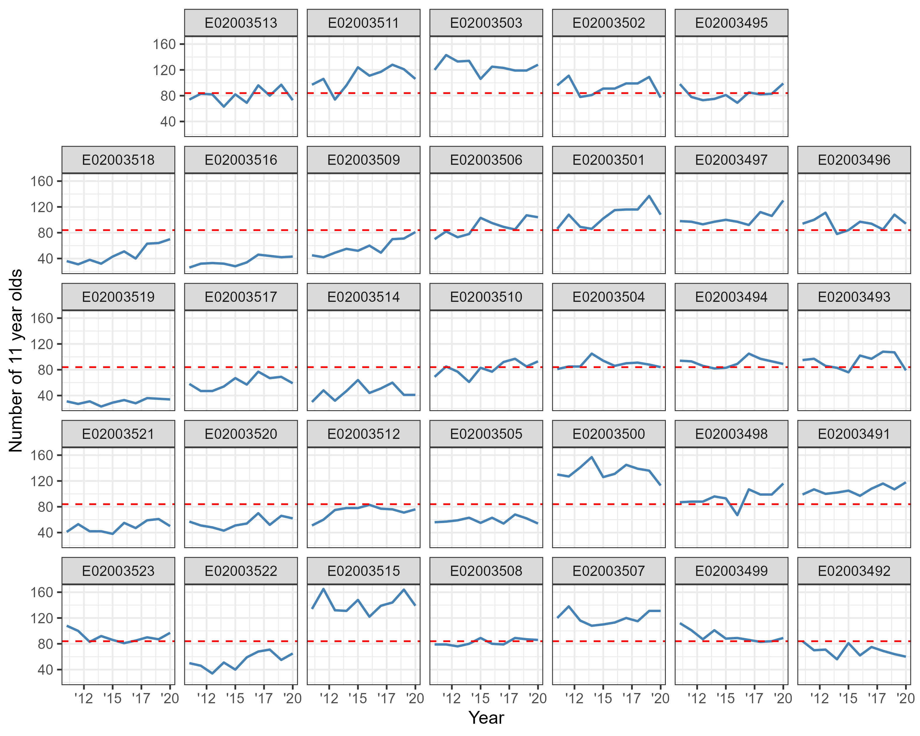
Brighton
Outputs were made to support reviewing the change in Brighton school catchment areas.
Geofacet grid of number of 11 year olds per MSOA in Brighton. Red line denotes the median value for the study area. Data source/packages: nomisr, gridmappr and geofacet
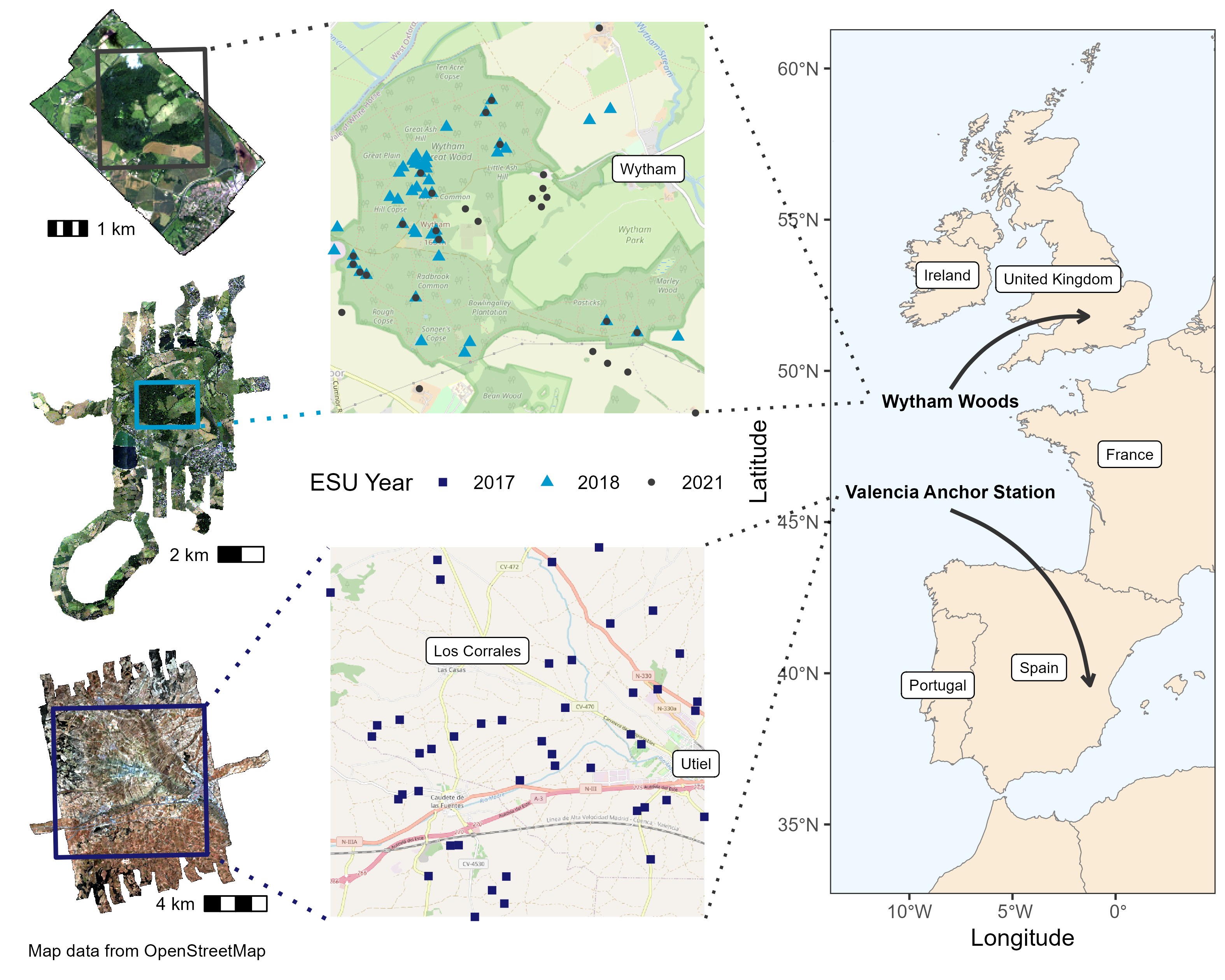
True colour composite airborne hyperspectral mosaics collected during the Wytham Woods 2021 (top left), Wytham Woods 2018 (middle left), and Valencia Anchor Station 2017 (bottom left) campaigns, in addition to the location of the elementary sampling units (ESUs) in which in situ LAI and LCC measurements were performed (middle), and the location of each study site (right)
In progress
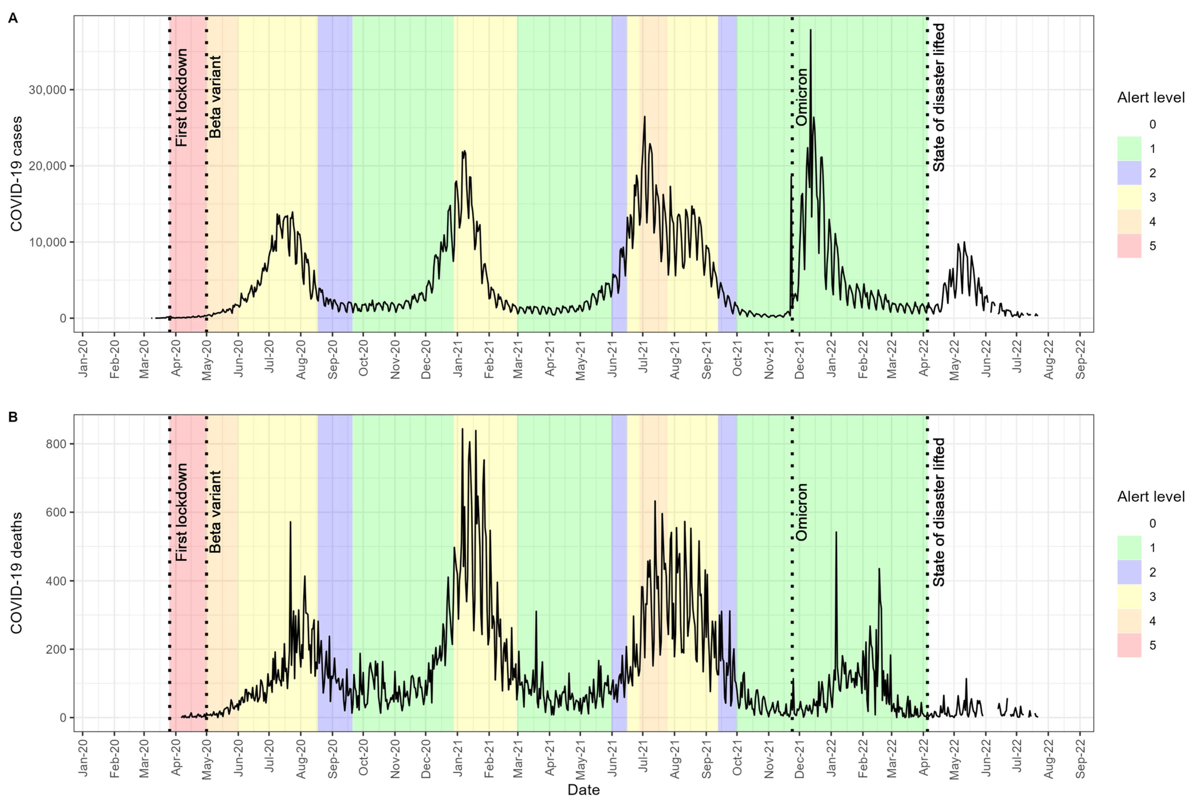
COVID-19 reported cases (A) and deaths (B) in relation to the South African alert plan and contextual information on COVID-19 variants. Data source: COVID-19 Data Hub
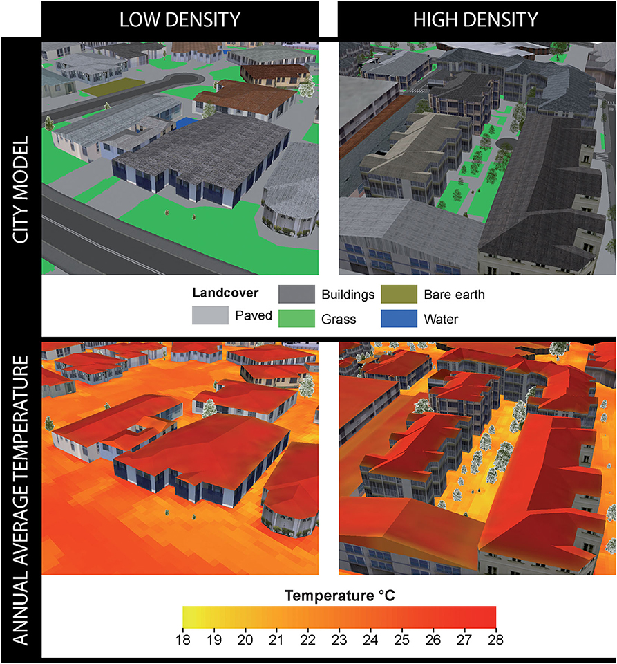
Three-dimensional city models (top row) and average annual mean radiant temperature (Tmrt) overlays (bottom row) for subsets of two SA1 locations representing low-density (cul-de-sac in Currambine) and high-density (infill site in Subiaco) developments.
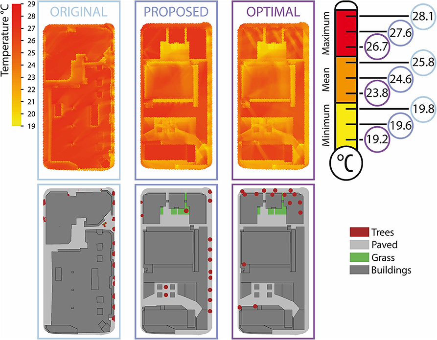
Average annual temperature using the original urban footprint, proposed redevelopment plans, and proposed plans with optimal tree placement. Also indicated are the average annual minimum, mean, and maximum mean radiant temperature with color-coded circles for each urban footprint scenario. The proposed redevelopment constitutes increased building height and variation across the site enlarging shading potential, reducing site mean radiant temperature compared to the original urban area.
Back to top